Description
by Riley Trist, December 2022
According to a blog post from the Met in 2015, digital has been the Met’s “most effective tool for sharing their collection with their new and existing audience.” And so, they explain throughout the blog post, they intend to prioritize it. This section attempts to show where and how they’ve implemented that ideology.
How is the Met's digital content integrated into the physical museum space? Does the design of the exhibition space encourage the use of digital content?
In the Met’s newer temporary collections such as The Tudors and Afrofuturism, QR codes are placed at the front of the gallery space which direct visitors to the website. The Tudor exhibition tab on the Met website includes the audio guide and some additional content like informational videos. In these sections the QR codes are used very often because they are so visible – thus visitors not only know that digital content is available, but are able to immediately utilize it.
However, in some of the older more permanent exhibitions the Met has placed fewer indicators of digital content. The Greek and Roman art wing has two QR codes placed at the mouth of the wing.
The QR codes lead to an AR application in which you can view an augmented reality version of the sphinx in different stages of aging and access additional information about the sphinx.
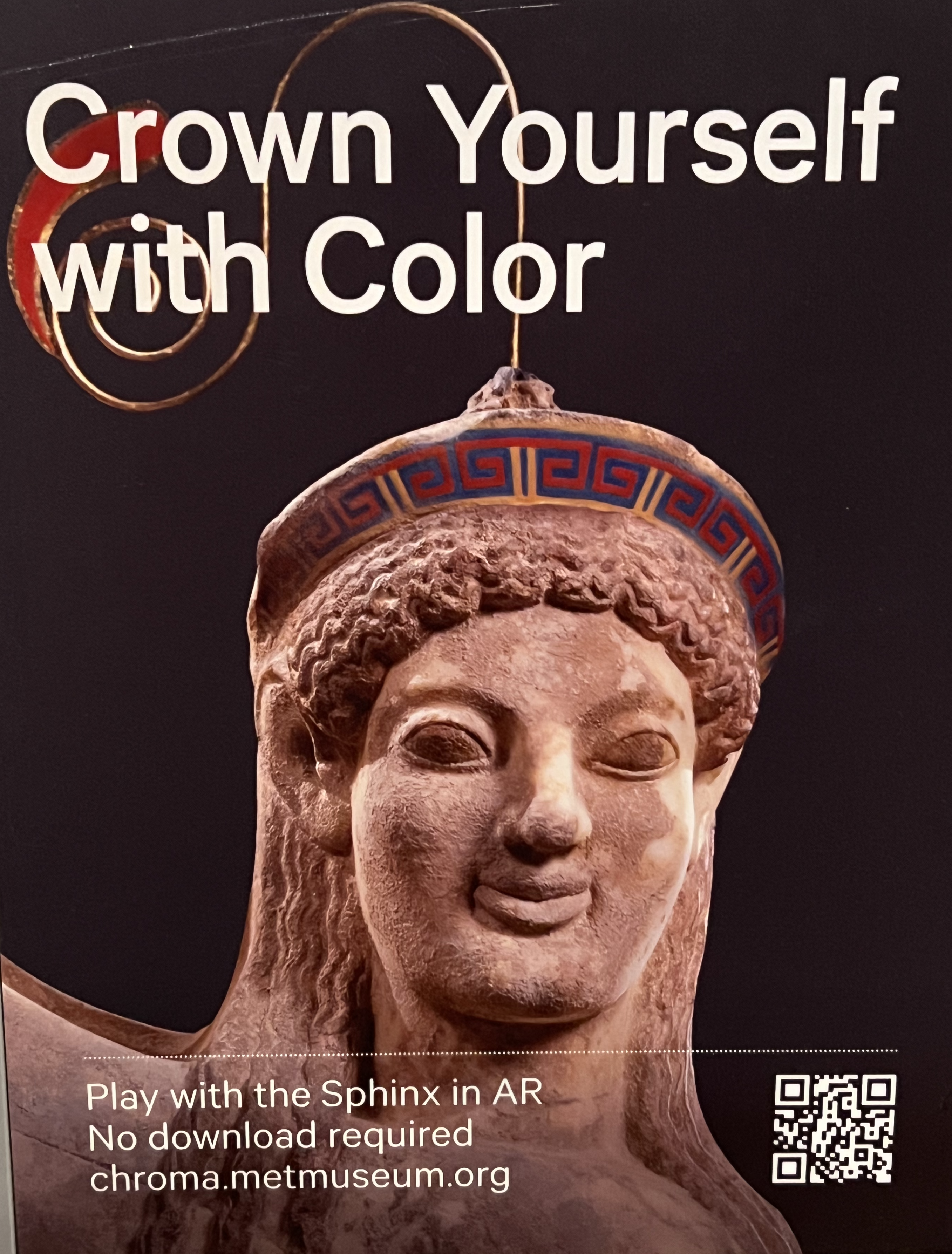
Though this AR element is interesting and engaging, the placement of it causes confusion and leads to less people using it than otherwise might. It is placed at the mouth of the exhibition but the real sphinx statue is further into the exhibition. So when scanning the QR code a visitor might be expecting to see an audio guide or gallery overview but is instead directed to an AR element that takes a bit of time to set up on their phone. So for the visitor who is just casually and automatically scanning the QR codes, the AR feature is unlikely to be fully explored as it should.
There are no other QR codes included in the Greek and Roman art wing. The numbers can be plugged into the audio guide accessible on the website, but that is not indicated in the in person experience at all.
Other wings, like that for Islamic art, does not utilize QR codes at all. And many of the numbers for the audio guides don’t work on the phone at all. (According to a museum worker who was asked about this, it’s because those numbers are old and out of use even though they are still on the wall.)
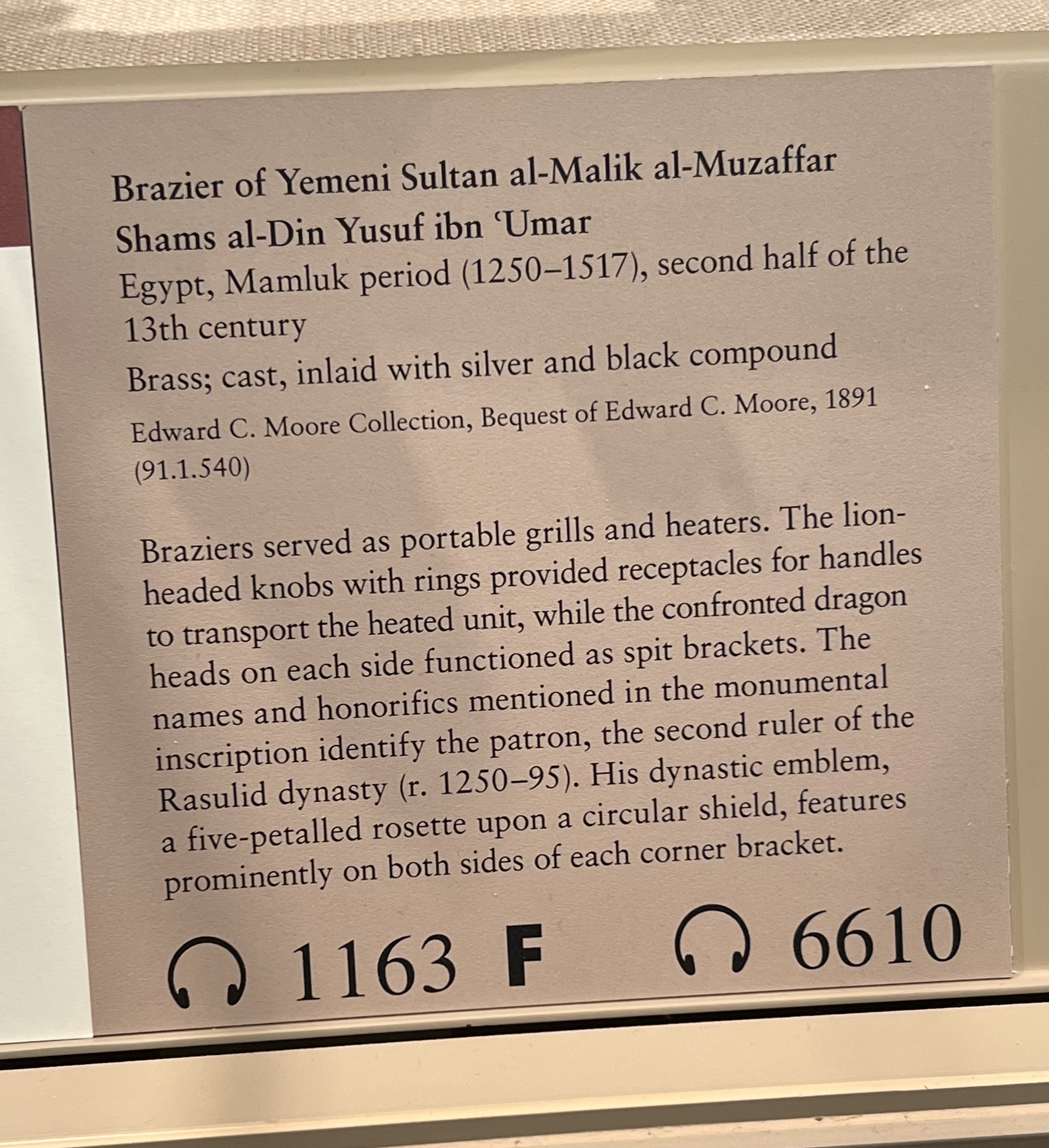
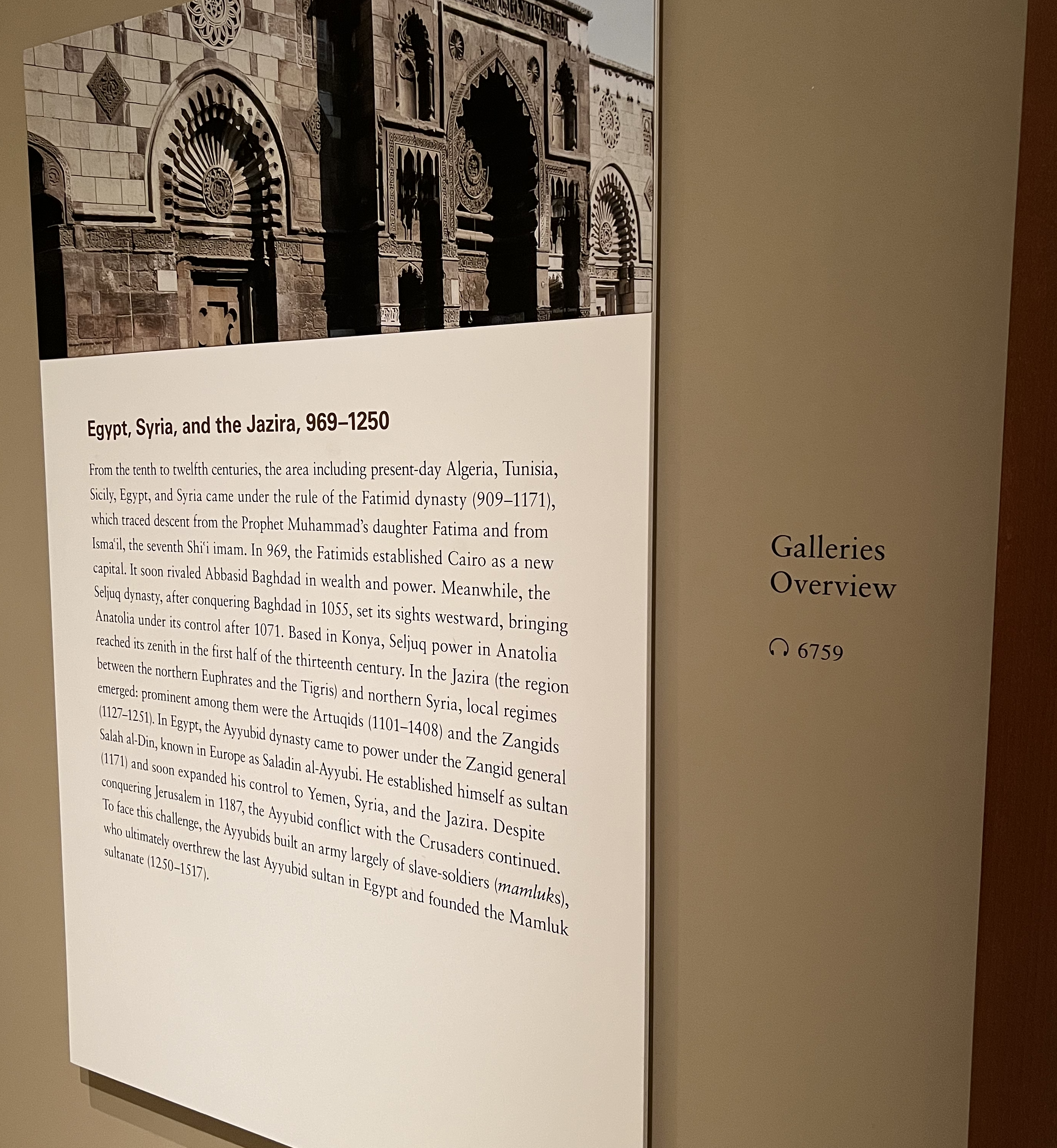
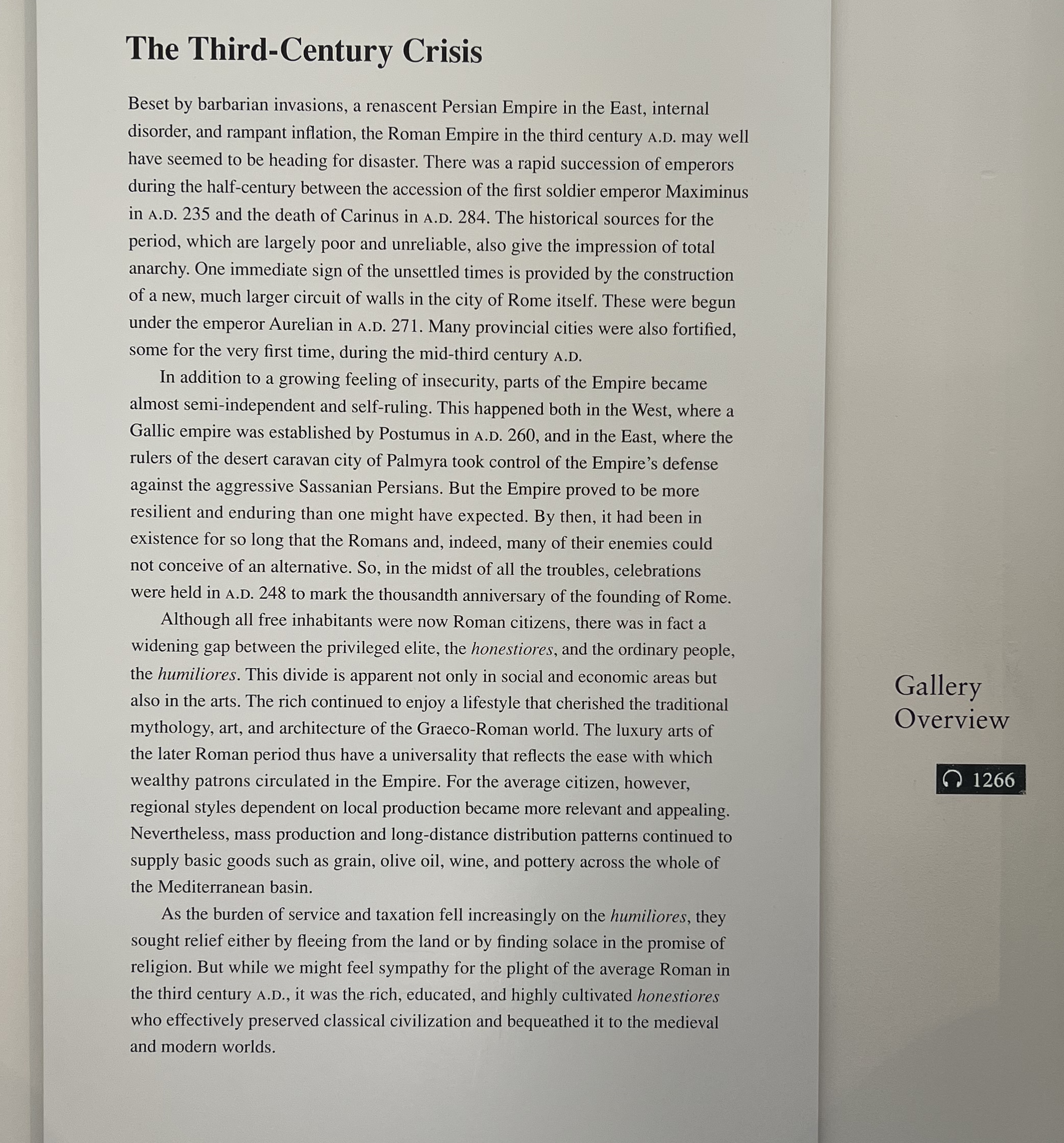
However, of the more permanent exhibitions, there are some which are utilizing more digital content. The Art of Native America does include a QR code that directs visitors to the audio guide on the website.
This section of the museum has clearly been updated more recently, so perhaps that is why digital content is integrated here but not in other permanent exhibitions.
How does the digital integration impact visitor experience?
When availability of digital materials are communicated to visitors, those digital materials are able to be utilized to their fullest potential. Many of the audio guides available on the Met’s website have full transcripts available.
So if hard of hearing or Deaf visitors knew that material was there, they would be able to access the audio guides through a visual format. But as there are no indicators in the physical space, there is no way for people to know that’s available unless they look it up beforehand.
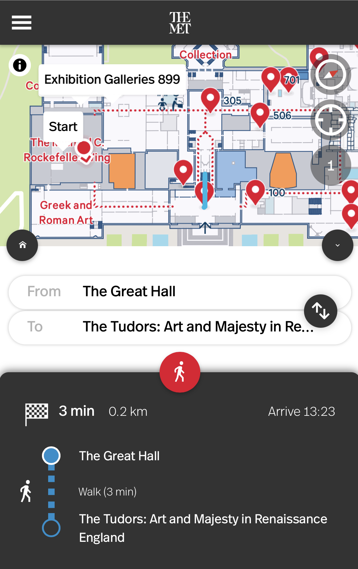
The museum map is also mostly available digitally. You can still find a physical map at the Met, but they are placed sparingly and paper copies can only be found at the entrance. So visitors are forced to use the digital map which has some issues.
As it is on such a small screen the elements of the map are very difficult to see. The map does allow the viewer to search where it is they’d like to go. But the search function does not have autofill – meaning that if one doesn’t know the exact name of the location they’re trying to reach they won’t really be able to find it. If one does know the name of their desired location and is able to find it on the search feature, they are then faced with the realization that the map does not actually direct you.
As pictured, the directions are simply “walk 3 min” which is extremely unhelpful. There is a red dotted line shown on the map of possible paths, but where one is on the line, what entrances or exits they need to take is not indicated, making wayfinding very difficult. So visitors, if they can’t figure out the confusing directions, must simply follow signs put up in the physical space.
← Previous: Introduction